
Visuals remain one of the most powerful and arresting means of communication both online and offline. They are one of the most visible and evocative elements of a brand identity, and illustration can play a key, powerful part in this.
A brand identity is typically made up of a variety of visual elements - logo, colour scheme, typography, iconography, photography, and illustration. When developing their brand identity, companies look for ways to make the visuals feel as unique and tailored to the brand as possible. However, for speed and ease companies sometimes opt for stock photography. While stock photography has its place, and can be great for cost-efficiency, it’s less distinct within the market, and is less effective for conveying complex ideas. Here is where illustration can make a great impact.
How illustration can transform a brand identity
Our world has increasingly become a visual one. With an ever more competitive attention economy, lengthy pieces of content can be less successful in sustaining engagement and getting their point across. By contrast, illustration is a powerful means of expressing complex ideas, while also being accessible and relatable. Using an illustration system to simplify a concept and bring it to life through story, colour, and character, evokes more empathy and a more emotive response from an audience.
One of the greatest strengths of illustrations is their ability to be completely tailored to specific purposes and use cases; being both more flexible than stock photography yet cheaper than original photography. They can easily be matched to a brand’s colour, tone, and style, while also helping a brand stand out from its competitors. It’s often the case where they can also be used in more scenarios than photography, allowing for more vivid branding to be injected into a broader range of brand touchpoints.
By creating a bespoke and unique illustration style, companies allow their brand to be instantly recognisable and to bring their vision or product to life; something that audiences can easily become familiar with and are able to process quickly. Aligning illustrations with their brand values, mission, and vision, companies can significantly improve the way people perceive them, recognise them, and remember them.
When used effectively, illustrations can also create a warmer and stronger personality that can draw people in, helping to better convey the tone of voice and approach. They can capture a complex story and express it in a way that inspires positive feelings about the company’s products.
How are brands using illustrations?
To visualise and better understand what we have discussed so far, we analysed how some brands use illustration systems to differentiate themselves, lift their image, simplify complex concepts, and tell their story in a cohesive and recognisable manner.
Headspace
Headspace has one mission: to improve the health and happiness of the world. Using a consistent colour scheme of orange and blue with soft rounded shapes, Headspace introduced a wide range of character-based illustrations that create a positive, accessible, and friendly feeling towards their brand image.

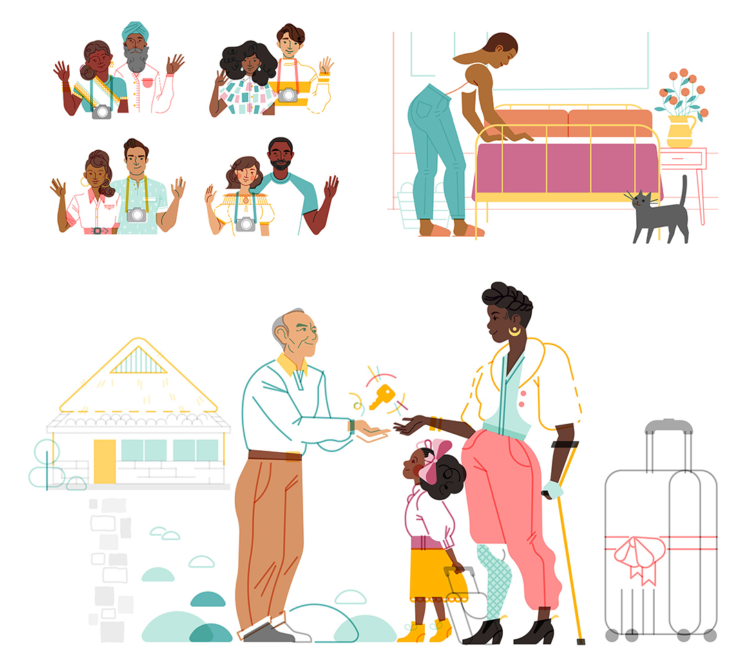
Airbnb
Airbnb’s mission is to connect people across cultures and continents. Thus, their illustrations system shows and reflects the communities they are bringing together. While their illustration style has changed significantly over the years, their current approach shows a diverse range of people that helps to reflect the brand’s ultimate commitment to inclusivity.
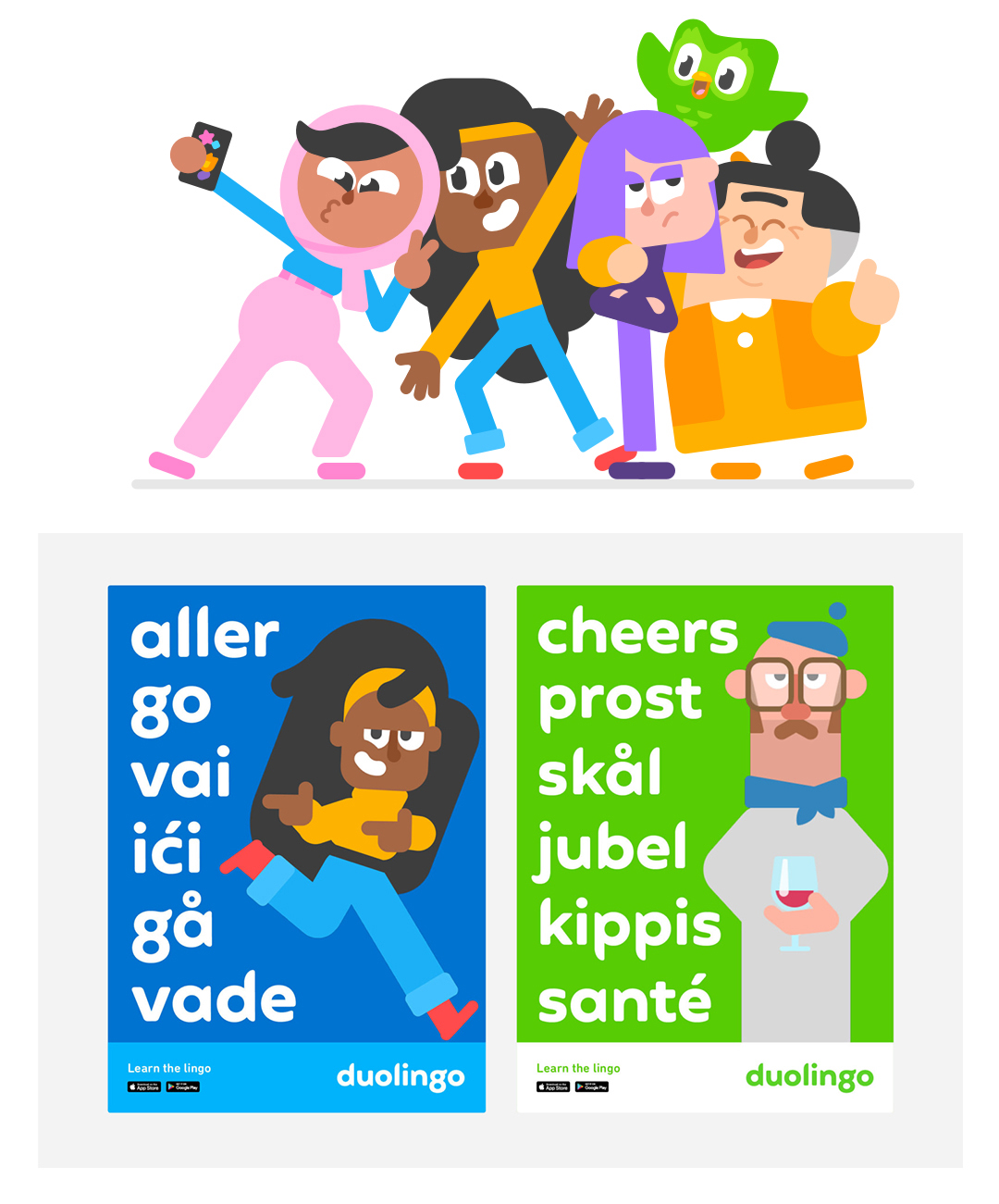
Duolingo
Duolingo is a highly visual brand and illustration is a key and distinctive part of their visual identity. They follow a set of guidelines that encompass rules on construction, rhythm, simplicity, shadows, shading, and colours. Setting out these guides still allows for playful, vibrant, and colourful characters. Taking design cues from their mascot Duo, they recently updated their range of illustrations to continue to evolve in their expanding universe.
Uber
With clean simple lines and a limited palette, Uber illustration system employs a more geometric approach to their artwork. A use of white and negative space allows for an interplay between back and foreground.

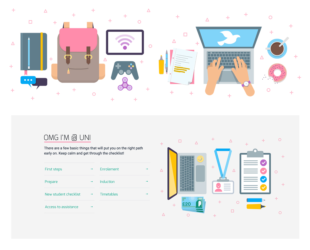
University of West Scotland
The University of the West of Scotland was looking for a way to capture the student roadmap through the first couple of months at university. Using their colour palette, our talented illustrators here at Screenmedia created a scalable and modern style that helped to capture the multiple experiences faced by the first-year students.
Notion
Using minimalist black and white doodles, Notion has developed a wide range of figurative illustrations that give a unified look and feel that helps to describe their all-in-one collaboration platform. A step away from the colourful approach of other SaaS brands, this bold and monochromatic approach is refreshing in its simplicity.

There are specific occasions when illustration isn’t just a nice to have but becomes a necessary addition to the brand identity. This may occur when:
- Concepts are hard to demonstrate pictorially
- Themes and subjects can be hard to represent with a single picture
- Abstract ideas cannot be portrayed with a photo
- Subjects are too ambitious to photograph.
In these cases, illustrations add personality and creativity to the brand identity, and they are a fantastic way to be more easily recognisable and to better communicate brand concepts to your audience.
If you are looking to bring your brand to life with illustrations, get in touch. We would love to hear from you!

Brian
Senior Illustrator